Reverse Engineer a Sponsored Promotion Post

Standard

I chose the Polar Stuff promotional ad, because of the beautiful, outdoor picturesque scene exploding out of the image. I love the outdoors, I love nature, and I love getaways.

Polar Contest

The colors and contrast (represented by the blue box) in this ad were so awesome. Although the picture was obviously taken at night, it still showed a very bright essence to it. I love the warmth of the colors, and how incredibly inviting they are to the visitor. The white type (represented by the orange box) stood out very well in the photo, as I find white can sometimes be very difficult to use, because there needs to be a very stark contrast in order for it not to fade away in the image. Kudos to them.

Additionally, they were smart in using a very simple font (represented by the pink box), as there is already a lot going on in the image, so it did not need to get cluttered up, by using too fancy of a font. The location of the Inn in the picture worked very well, its placement was not quite in the middle (vertically) of the image, and since they had it bleed horizontally, I don’t think they broke any design principle rules. I felt over all the promotion image had great design. I would not of minded a little better vertical placement of all the type, so there was a little more breathing room in the image, but still a great ad.

Polar Contest Reverse Eng.

The first thing that came to my mind with the Seascape principles was value. This promotion with Polar Stuff definitely represented a great value, as the prize for entering the contest was a 2 night stay at a beautiful Inn, some Polar Stuff Gear, food and drinks, and an online Photoshop workshop. All you had to do was fill out a form to enter the sweepstakes, no purchase was required. The Expectation Principle would definitely be applied for the winner, but I think also for the non-winner too. Most who enter this contest are going to be people who are familiar with the Polar line, so they will get the opportunity to see what Polar is showcasing that may be upcoming and new. I also think they were able to utilize the Principle of Least Resistance. How much work is it to fill out a short form, with the possible outcome of this great package, well worth the effort.

Reverse Engineer a Native Video

Standard

It was my desire to have the opportunity to “Reverse Engineer a Native Video” on Celiac Disease, but interestingly enough, I could not find anything that was worthy of analyzing. This was very disappointing as I’m trying to get as much experience and research on other Celiac disease websites as possible. At this point I decided I would just peruse my Facebook account wall, but almost came up empty there too. Its always when you really need something, that you can’t seem to find it. I ended up finding the video below, which really captivated my attention. I love country music, so it was right up my alley. These reverse engineering projects definitely help strengthen our understanding in regards to the graphic design principles, and also the seascape principles. I’m loving that I’m becoming quick to see principles that are not being utilize properly, so that I can avoid making those same errors in my own designs.

Toby Video

Overall, I felt like they did a pretty good job with the production and design of this video.

Toby Video Reverse Engineering

The gold lines represent the great job they did utilizing the “Rule of Thirds” principle. Toby’s face is almost exactly right in the upper, left quadrant. His positioning really helps with the overall design of the frame, and assists with helping the eye draw attention to both him and the text in the right quadrant. Good positioning allowed for plenty of room for other very important content.

The purple represents the typography in the frame. I thought they did a pretty good job with the placement of the typography. I found that my eyes go right to it, so I know immediately who and what the video is about. Additionally, I liked the font they used, and think they did a great job with sizing Toby’s name, but I was not super thrilled with how they showcased the tour title. I think they should have included “Tour” in the blue color scheme. Also, I would have liked them to have had the tour title extended all the way to the “Y,” to give it better alignment, it feels like it is just hanging there.

The blue lines represent the frames contrast. This frame does not have start contrast, but I really like it. Anyone that knows Toby, understands that he is a very patriotic person and loves his country, this is very well represented. The colors exert a vibe of serious patriotism, strong nationalism, and great country music. I love the old heritage, antiquish vibe to the colors of the flag.

As far as the seascape principles, I think the following have been utilized quite well. The Presentation Principle, The Principle of Least Resistance, The Attention Principle, and The Principle of Expectation. Toby is definitely presenting a strong vibe that this is the video to watch if you are ready to listen to some down home, country music. People who visit this video have an expectation of hearing great country music, and getting some information on where and when they can see Toby in concert. Its visitors would be quite frustrated if this video did not deliver such information, so lucky for us it did. For sure, this is the path of least resistance. How easy it was for me to find out that Toby had a new concert tour happening. All I had to do was enjoy a little Facebook perusing, the next you know Toby’s video pops up, I click on it, and find out something I did not know, where and when Toby is on tour and how to find tickets. No energy exerted. The Attention Principle is a given, you can’t possibly be a famous singer without loving the attention, if you don’t, you are in the wrong business. I think this video frame is definitely an attention grabber, and all of its design is very intentional. It is all about saying, “Here I am,” come see me!


Reverse Engineer a News Feed Post

Standard

Since my brand is Celiac Disease awareness, I thought it might be good to analyze a post that was in the same brand arena. I thought this would help give me ideas for my own brand, while also seeing what works and doesn’t work. You never know who is running the show behind the scenes with certain companies. Sometimes they are expert web designers, and sometimes someone gets called to duty without any experience, and has to either sink or swim.  I have seen this happen in my own current field. Are they just posting information, or are they trying make sure their posts are visually appealing and engaging?

I have to say, I think they did a pretty good job wheeling me in, and encouraging me to use this as my post to analyze. I feel like the post initially connects to its audience by making it very well know they have something very important and relevant to share. The image through its bold text, and strong call to action, encourages the visitor to want to know more. I definitely feel this post represents the principle of expectation. When I opened the link in the news feed, I definitely was not disappointed. I learned new and valuable information about Celiac Disease, info that for sure needs to be shared. All the information shared also represented well the value principle. There is no doubt that anyone who takes the time to read this post will find tremendous value in the data it shares, especially since it speaks of the long-term damage that is a result of a late diagnosis of the disease.

News Feed Assignment

My purple lines represent the Rule of Thirds, which I believe are well represented here. I think they did a great job purposefully placing their images and text, in order to bring great flow to the overall design. Placement assisted in helping the eyes immediately connect to the text, which is the most important piece in this feed.

As we can see with the text, it also had great alignment within the thirds, which was called out with the brown line. The text has beautiful alignment, and so gracefully fell into the Rule of Thirds, which resulted in a very eye catching arrangement.

The green lines represented what I found to be a great combination of text sizes, styles, and colors. The designer chose fonts that very well complimented each other, and followed the design principles. I don’t know if I was overly sold with the overall color scheme of the design, but it definitely had a nice flow, a good call to action, and was visually engaging.

News Feed Assignment copy

Reverse Engineer a Social Media Brand

Standard

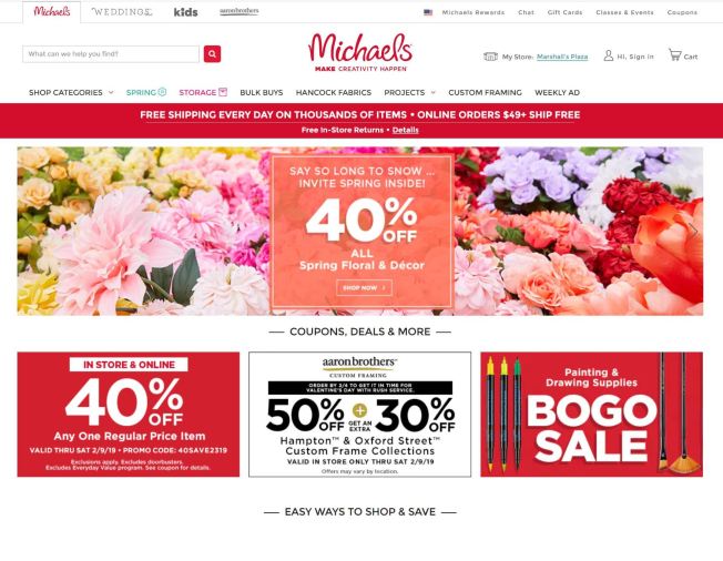
I decided since I’m so in to crafts, sewing, and design, that the perfect website to visit and analyze would be either JoAnne’s or Michael’s. I ended up deciding to move forward with Michael’s, since I found their website to be very eye catching at first glance. I was very curious to analyze a website that is truly dedicated to inspiring people to design and create, and seeing how well they successfully incorporated the principles of design within their own site.

Michael's 2

Right now, Michael’s is connecting to its viewers through its Valentine’s Day promotion, which is currently boasting very traditional reds and pinks, true for the occasion and its own traditional design. Additionally, Michael’s continues stimulating inspiration for its viewers by showcasing its best products with warm and beautiful colors.

Michael's 1

Key:

Rule of Thirds – Green

Typography – Blue

Not Half – Brown

White Space/Proximity – Yellow

Logo Size – Blue-Green

Michael's Draw Over 1

This site definitely does not follow the “Rule of Thirds” principle, everything seems to be very center aligned. They seem to follow a very straight forward approach that works, but what kind of attraction would they bring if they added a touch white space, employed the “Rule of Thirds,” and a more creative “Call to Action?”

Their colors are very simple for the most part, with the foundational background colors being red and white, and their text predominantly being in black. These colors are used fairly strategically, as to not clash with their craft item colors, which are generally very bright or very neutral.

Michael's Draw Over 2

Their typography is simple with a warm inviting vibe. Reminds me of Calibri, one of my favorite fonts. Carry’s a nice, professional look with a fun, curvy characteristic. I do think the logo typography is very cool, but could be showcased better if it was a little larger. Michael’s has a pretty well-known logo, but I truly think the website could benefit from an increase in sized with the logo.

I think they did a great job with proximity and making sure there is plenty of white space. Even though they are showcasing a lot of product, it is easy to move through the products without feeling overwhelmed.

In regards to the Seascape Principles, I definitely think the “Value Principle” is very well represented on this site. First of all, they have their coupons big and bold, and front and center. Everyone loves Michael’s coupons, and the great savings that come along with them. Additionally, the value of inspiration goes a long way. This site showcases many different arenas of creativity, and there is definitely something for everyone. People love the feeling of giving a gift that has been crafted by them, and embodies the messages “I Love You.” I also think the “Principle of Expectation” is also shared within this site. People expect to save money, to get a great bargain, and to be inspired while doing it. I think more times than none, these expectations are achieved.

Overall, I think they have a very nice website. The principles that have been employed help the visitor navigate through a very colorful and active site. It has a nice flow and vibe, maybe just a little bit cramped of product. I found the site to be very user friendly, to be very informative, and to be very enlightening.

My Personal Manifesto

Standard

blog title

Developing a personal manifesto can be quite challenging, but in the end, quite inspiring. It makes us analyze the inner soul, and allow our desires to be revealed to the conscience mind. Many of us dread going public with our dreams and desires, in fear of rejection and ridicule. I’m here to tell you, it does not matter what anyone thinks, but you and the Lord.

Which leads me to my first objective, “teach and inspire others that no matter how tough life gets, you can still accomplish your goals.” I’m so fortunate that one of my blessings in life has been “strength of character.” Through my entire life, I have carried with me the thought process that there is nothing that I can’t accomplish. I can’t imagine what my life would have been like without this belief system. Although I was raised in the church, my childhood was about as challenging as they get, and life did not seem to get easier with age. Before the age of 40 I had already survived cancer twice, been diagnosed with two autoimmune diseases (Celiac and Thyroid), and told I was allergic to 50 different foods and additives. My health continues to be a struggle, with new health concerns each year, but this has not stopped me from believing and insuring that I have a full life. I have questioned my faith many times over the years, but I always circle around to “there is a lesson to be learned, and I’m still here for a reason.” I’m confident it is partly to influence the hearts of my grandchildren.

erinTphotography0003.jpg

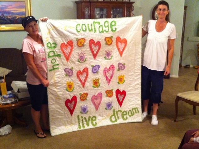
Which leads me to my next objective, “to inspire others to cultivate their talents.” I truly believe that true happiness partly lies in having a hobby, talent, or passion that inspires you. We all have them, but some of us choose to ignore them. Ignoring these talents causes unavoidable voids in our hearts, and leaves us continually searching for something more in life, when it is sitting right in the forefront of our minds. My passion is quilting, and I have a great desire to share this with others, and assist in continuing this great tradition.

fb_img_1476667018894

My Sister-in-law Lori

My Sister Lori and I

As a very young child I knew that I wanted to be an artist, always hoping to get into animation. Losing my mother at 15, and being out on my own at 17, forced a different path. I chose to attend graphic arts school, hoping that this would help me land a fairly good paying job quickly, which it did. I did that for about 10 years, until I landed a job in management. Now, twenty-five years later, I have come full circle to learn graphic arts from a digital aspect, and I absolutely love it. This background has shaped me to become a very inspired quilter, and I want to share the love and passion I feel when quilting with others, especially my family.

img_3751

My social media objective for this semester is to share my talents, inspires others to cultivate their talents, and inspire all to pay it forward. As of now, I feel my channel will be Facebook and Instagram, as I feel very comfortable using them, and I already have a strong following. As of right now I’m striving to create a blog, share videos, and pictures. I believe most creative souls are very stimulated by visuals and those who don’t believe they are creative, can be very inspired by many types of visual forums.

One of my ultimate goals is to finish my BS in Web Design and Development, being the first in my family to achieve a degree. I’m so blessed to attend BYUI, and have the opportunity to attend a university that is in line with my spiritual and educational goals, and works within my health parameters. So Blessed!


Reverse Engineer a Social Media Post

Standard

I’m a huge proponent of education, so this quote really caught my attention. I’m a true believer of infinite education, and that we are never too old to learn. 

mlk

What is the main purpose of the post?

The main purpose of this post is two-fold. One, was to celebrate the life of Martin Luther King, Jr., and the other was to make people realize the true importance of education. To deliver his message that education is not just about trying to improve our financial status, but also about improving the character of our inner self. To strive to be better people and to be a stronger society.

Who is the audience of the post?

The post is meant to inspire society as a whole. The post was meant to not only reach the educator, but also the student. This post was definitely intended to be seen by all; family, friends, and coworkers. To deliver a message to the mass of the importance of an honest and pure pursuit of education

How does the post connect with the audience?

This quote connects through inspiration and desire to be a better person. Most who stop to take notice and truly analyze the meaning of this quote, are either respecters of Martin Luther King, Jr., or willing at least to appreciate some of his visions. This quote speaks to the inner being of human decency.

What value does the post provide to their audience?

The value is to understand there is more to education than just curriculum guided towards learning effective thinking, but also to discern the truths and untruths of society. To help us accomplish our goals, but to also understand the prejudices of the world. The value is in opening our eyes to the world and using the power of education to empower others.

How does the post’s design connect and communicates with the audience?

I think the post connects with its audience by showcasing Martin Luther King, Jr’s silhouette in a very prophetic way. Additionally, I believe the quote used was very poetic, and was displayed in a very eye-catching way. The idea was to get the reader to stop, and once they did, the quote would sale itself.

What metrics (likes, shares, re-tweets, etc.) will be used to determine if the post is successful?

Some of the metrics used to determine the success of this post are how many likes the post received, how many times the post was shared, how many reactions the post received, and how many comments were left by its visitors.

Social Campaign Analysis: “iHeartDogs: 0% Off.”

Standard

0%

The social media campaign I chose to analyze is “iHeartDogs: 0% Off.”

https://iheartdogs.com/why-our-black-friday-special-is-0-off/

As I was searching for campaigns, this is the one that stuck with me the most. I loved that the campaign was based on helping a cause that truly cannot help itself; animals, and most specifically dogs. The campaign’s overall objective was to reach the goal of giving 100,000 meals to dogs in need. I love the straight forward, but innovative way that it captured the attention of its audience.

During the 2017 Black Friday, iHeartDogs offered a 0% discount to all its customers, and in return promised to double its donations to homeless dogs.

double points

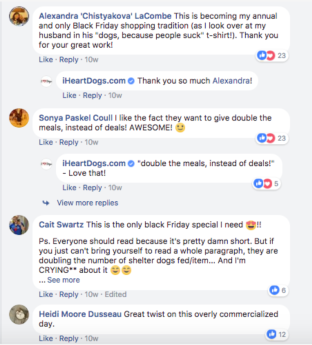
Its devoted customers really respected its motivation to support a larger cause of helping the defenseless, opposed to giving into profits. Their campaign to support the betterment of society paid off, iHeartDogs ended up doubling its goal, even with only using Facebook as their channel.

facebook 1

facebook 2

I think one the main principles enforced in this campaign was the “Value Principle.” The animal rights enthusiast or animal lover gained the incredible satisfaction of knowing how many dogs were going to be saved by the generous food donation by iHeartDogs. Obviously, many found value in this, otherwise iHeartDogs would not of doubled their goal of 100,000 meals, to a whopping 200,00 meals to dogs in need. Additionally, I think the “Story Principle,” to some degree played a role in the success of this campaign too. Most everyone loves to contribute to the betterment of a human and animal rights story. Everybody loves a success story, and what better success story than saving a dog’s life.

cyber monday    facebook 3

I believe the “Principle of Expectation,” can even apply with to this Campaign. iHeartDogs’s movement was very successful because of its base of customer loyalty, which in turn is because of the “Principle of Expectation.” iHeartDogs has rewarded its customers by assisting with fight to end the growing issue of homeless dogs. Because its clientele truly believes that iHeartDogs is in it for good of society, opposed to the gain of riches, it motivates them to continue to buy from their site, which in turn adds to the pool of resources needed to resolve this growing issue. By iHeartDogs doubling its expected goal, expectations were met on both sides, which means somebody did their research when building this campaign. As a matter of fact, their campaign was so successful, they ran it again in 2018. Kudos to iHeartDogs!

iheartdogs2018.png

L13: Weekly Reflection

Standard

I cannot believe we are approaching our last week of class, where have the weeks gone. This week has been all about Link Building and utilizing Google Analytics. I have to admit, it has been one of my more challenging weeks, as link building can be a little complicated to learn and comprehend. I’m still trying to do the research to have a little better understanding. I found the following site that I think is great about breaking down link building, and really helps explain how link building works and benefits our sites. https://www.pageonepower.com/link-building-guide. I got a little breather when we dove into the Google Analytics assignment. What we learned was quite exciting and educational, and very valuable to the future of our websites. There was definitely a high consensus of people on our discussion board who also felt very excited about Google Analytics, and what we had learned. It seems we all came to the same conclusion of how great this tool is, and what great benefits it will bring to us, as we continue to strengthen our website content. As usual, it has been a great week, full of very stimulating information. I’m going to miss this class for sure, but looking forward to my next adventure.

L12: Weekly Reflection

Standard

This has been a very enlightening week in regards to Social Media and Advertising. We see this all of the time when we are visiting the different medias that we are connected to, but I never really connected the dots until this week the incredible benefits of this type of advertisement direction. How we can reach the masses in such an easy and valuable way. Overall, the financial obligation is peanuts in comparison to the rewards we gain taking this route. We benefit from great networking where we can get some really great advice from professionals already in our sector or in the web design arena. How awesome that on some of the social networks you can create giveaways for your visitors. People love free stuff, and if that free stuff turns into a great experience, they are locked in and ready to spread the word to others. We benefit from getting it out to the fingertips of our close family, friends, and coworkers, who can assist in helping spread the word about our businesses. Social Media is only going to get bigger, stronger, richer, and bolder, so we need to hop on that movement while we can. I personally want to perfect an advertising experience with Facebook, Pinterest, Linkedin, and YouTube. I have a lot of work to do, so I better get cooking.

L11: Weekly Reflection

Standard

As usual we have had a very enlightening week, and full of incredibly beneficial information. I have to say this has been an amazing semester for me, and I have learned so much valuable information. I been wanting for years to understand the mechanics of making our websites successful on the web, and now I’m finally having that opportunity. I thought for sure that it might be overly technical and possibly boring, but not at all, I have loved every minute of it and have learned so much. We have been educated so well about keyword optimization, and how to get our Ads to benefit us to the greatest degree. Watching the progression of my site, as I learn each week new tools to utilize, has been so exciting. I can’t believe how much we have learned that just using our keywords within our pictures and titles, can change immensely the visits, clicks, and impressions on our websites. So cool to learn, and so cool to watch our sites grow.